Hue Perspectives
Accessibility Design
First created in 1936, DOMA was not built with accessibility in mind. Hue Perspectives strives to change that and make a space where all are equal. Hue Perspectives is a program being introduced to DOMA that focuses on the acknowledgment of colorblindness and addresses the fact that not everyone perceives color the same. This directly affects how one views and interprets art at DOMA.
Experimenting with the different types of colorblindness, Hue Perspectives will incorporate an exhibition at DOMA that will include both colorized and grayscale artwork. The colorized artwork will be created according to the different types of colorblindness and modeled after what one with colorblindness would see. While this is meant to give someone with normal vision the perspective of colorblindness, color-correcting glasses will be given to those with colorblindness so they can see in a perspective unlike their own and what the colorized artwork actually looks like. On the other side of the exhibition, grayscale artwork will be presented so that all viewers can see the same artwork and get the same experience.
Hue Perspectives was created with the idea that although we all may not be able to see the same artwork, the different perspectives that are thus created are unique and can carry great weight in the ways we perceive and interpret the things seen before us.
Visual Style Guidelines
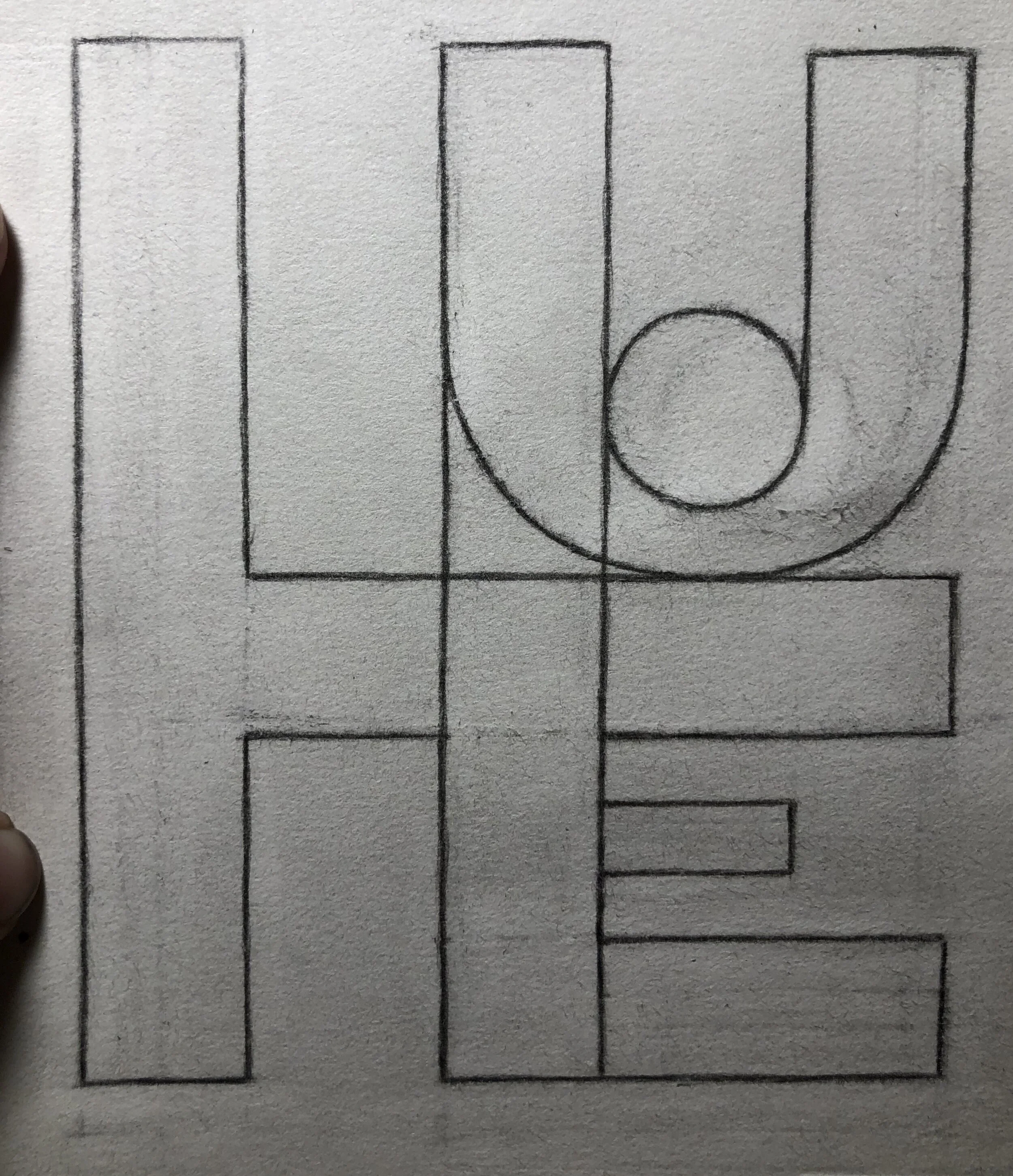
Initial Ideation, Sketches, and Design Work
Working with the first ideas I had, this design work was good but did not hit the mark right. Pushing through these ideas allowed me to broaden my design scope and create a more dynamic logo.


Reworked Sketches and Design
Experimenting with ideas besides the obvious ‘eye’, I focused on making the logo’s colors and the ways they could be received best, most important.



DOMA Logo Lock-ups

Final Deliverables
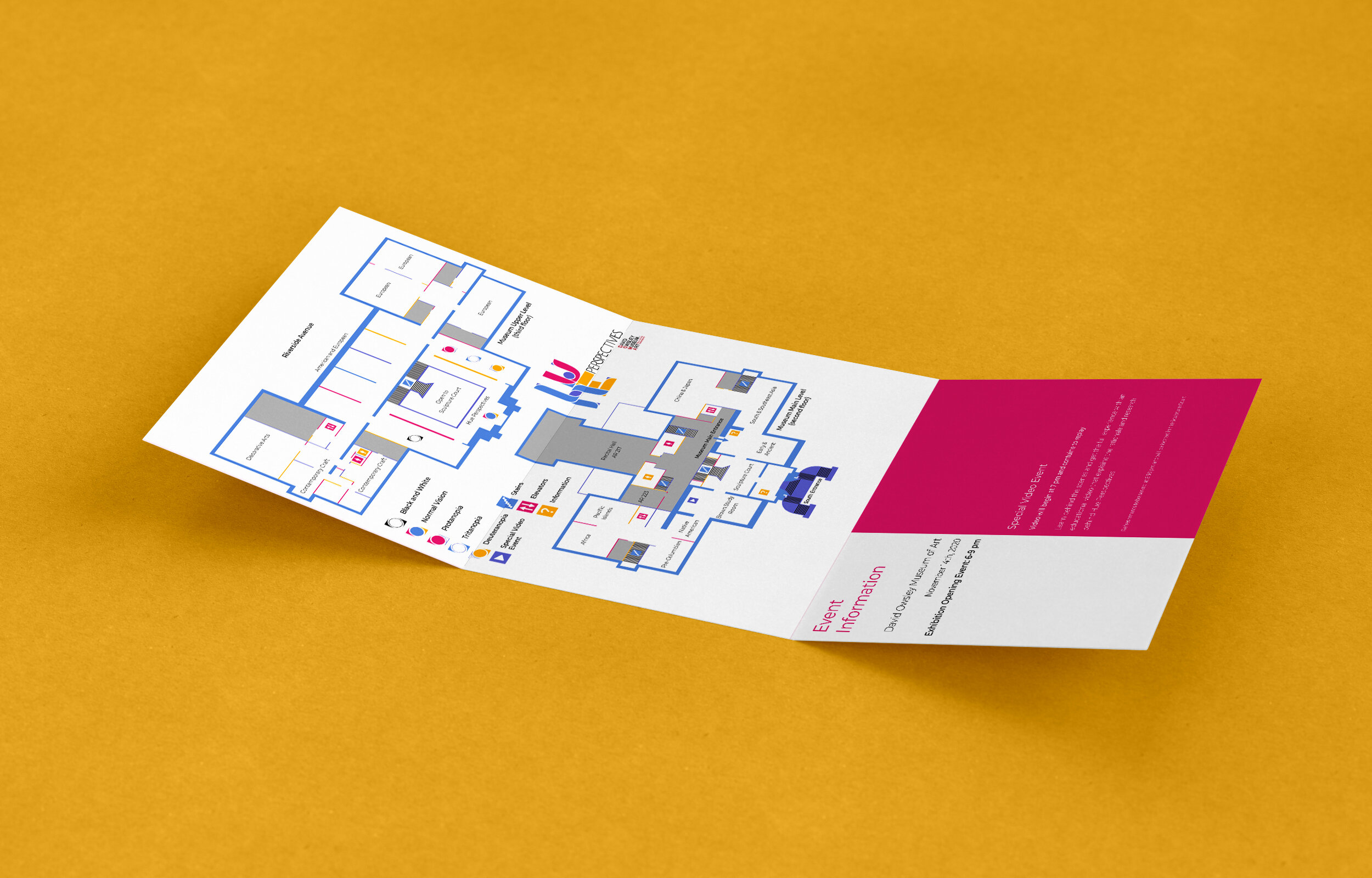
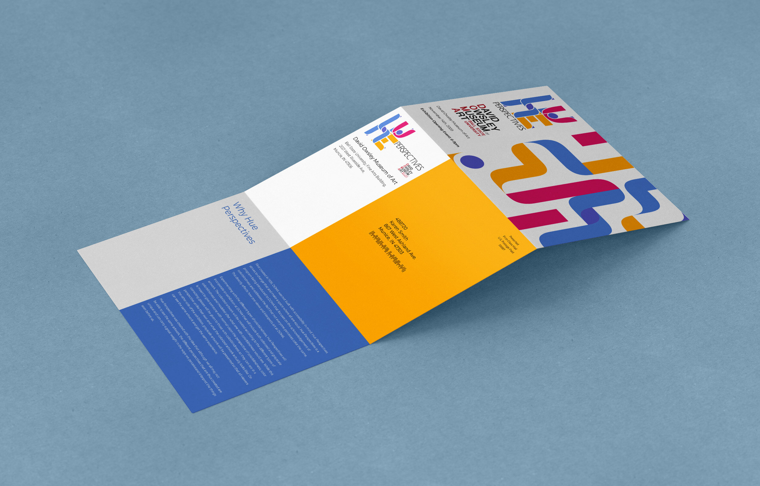
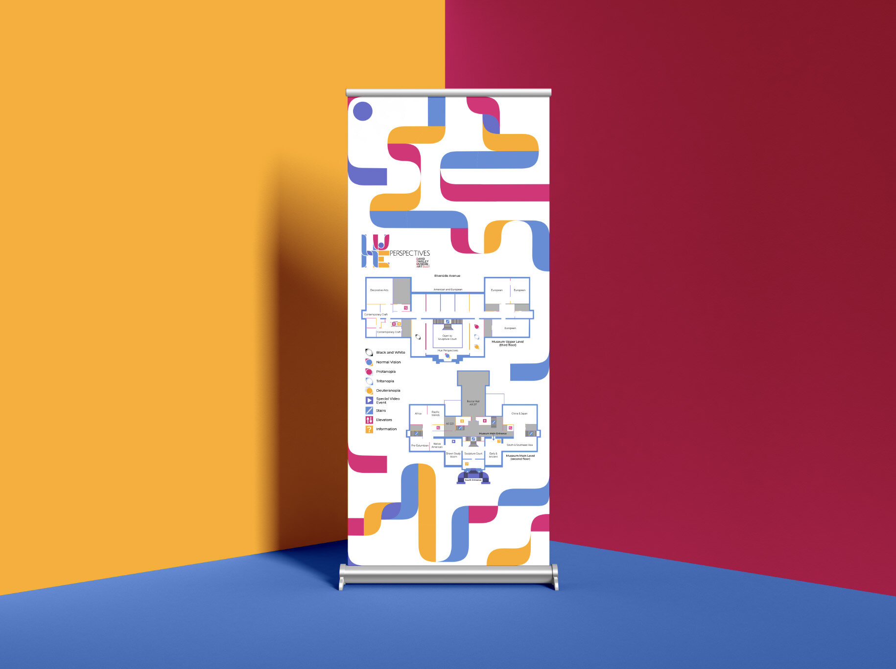
Creating a range of deliverables, Hue Perspectives utilized 3-D as well as visual work.

