Glick Center For Glass
Rebranded Logo and Online Advertising
The Marilyn K. Glick Center for Glass is a premier glass facility, emphasizing simple, easy-to-maintain spaces that are not over-engineered and are ultimately flexible. Situated on the southwest edge of campus, adjacent to Christy Woods and Ball State's Orchid Greenhouse, the facility opened its doors in 2011.
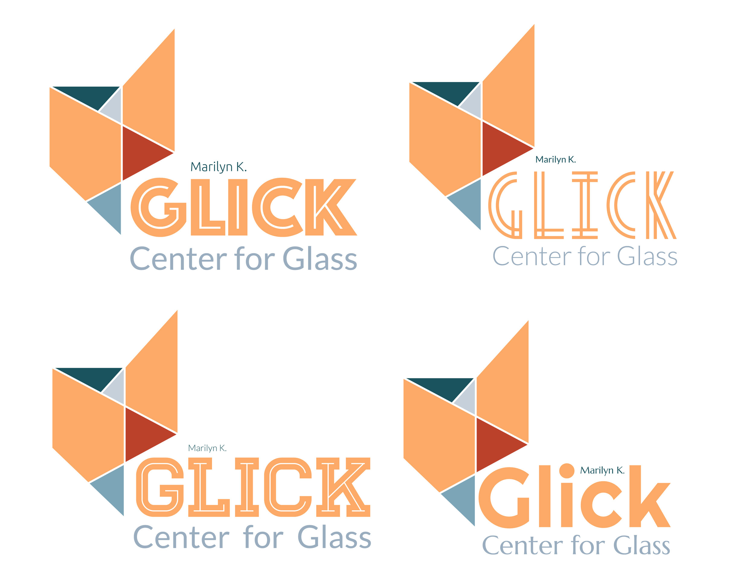
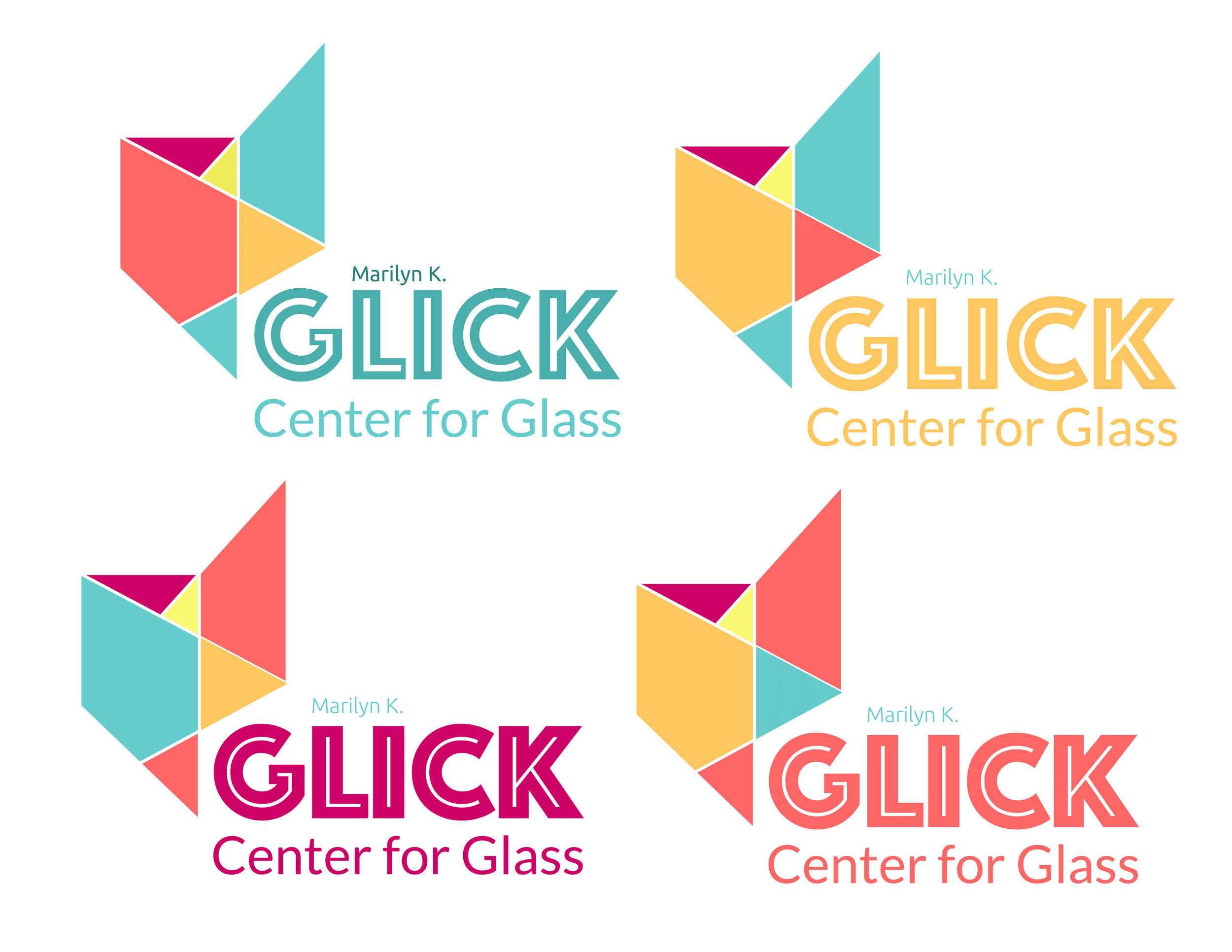
Since its creation, Glick’s has never truly been branded and given a logo. Taking aspects from the hot shop, cold shop, and neon studio, this logo compiles all of them into one logomark. Focusing on vivid colors, unique shape and form, and linear design, Glick’s rebranded logo is fresh, understandable, and recognizable. Situated on top of three different typefaces, each font serves a different purpose within this logo.
Visual Style Guidelines
Initial Ideation


Early Design Work
Working through many design ideas, the logo evolved multiple times during its creation.


Alternate Logos

Logo Utilization
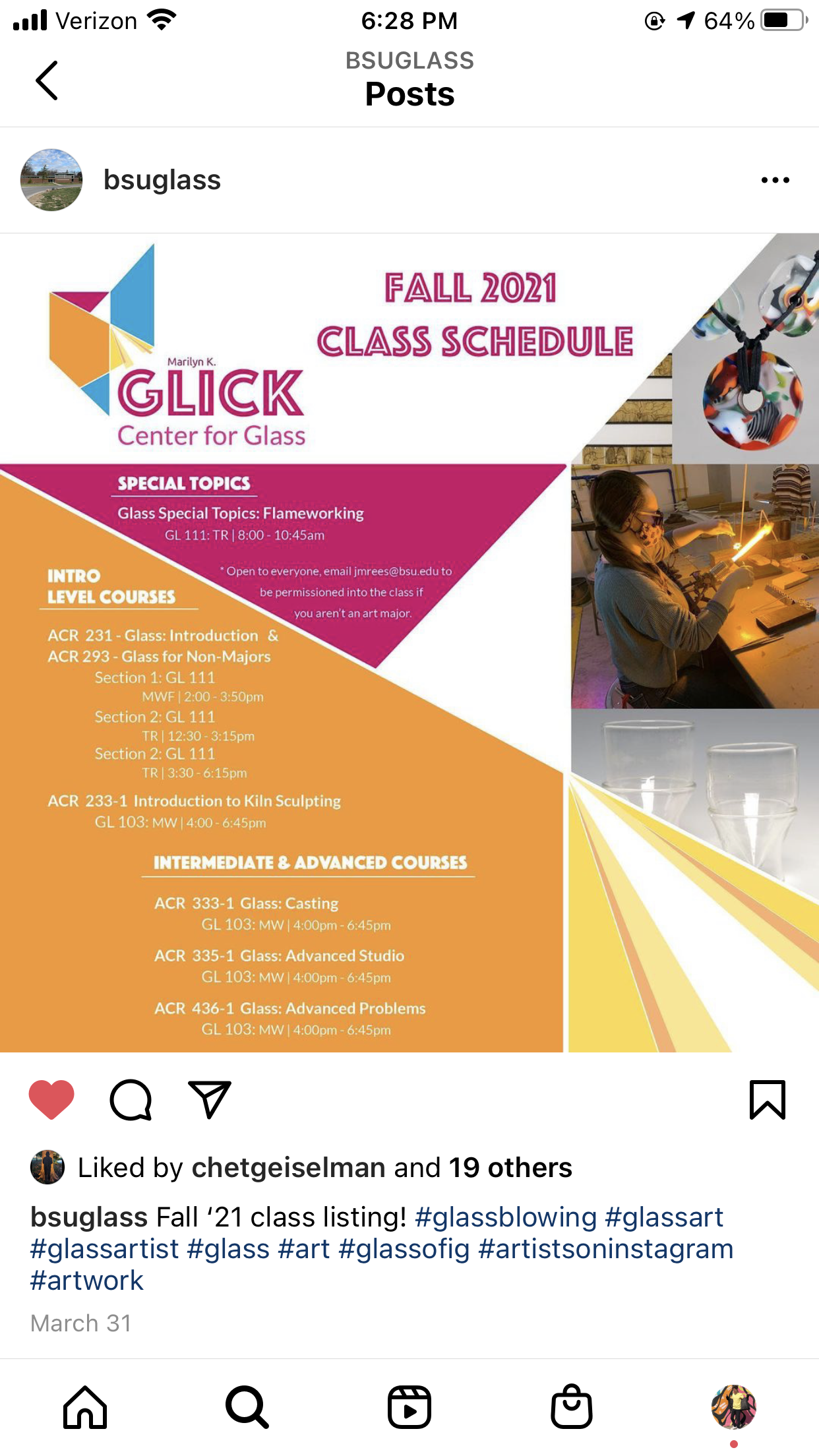
After the logo's creation, it was utilized and posted on Glick’s social media pages.


